Getting Started
Environment Setup
Before you begin, make sure you have completed the Set Up Test Environment step.
| Test | https://pay-gate-uat.checus.com/aggregate-pay/api/gateway/<PATH> |
| Production | https://pay-gate-hk-prod.checus.com/aggregate-pay/api/gateway/<PATH> |
Interaction Flow
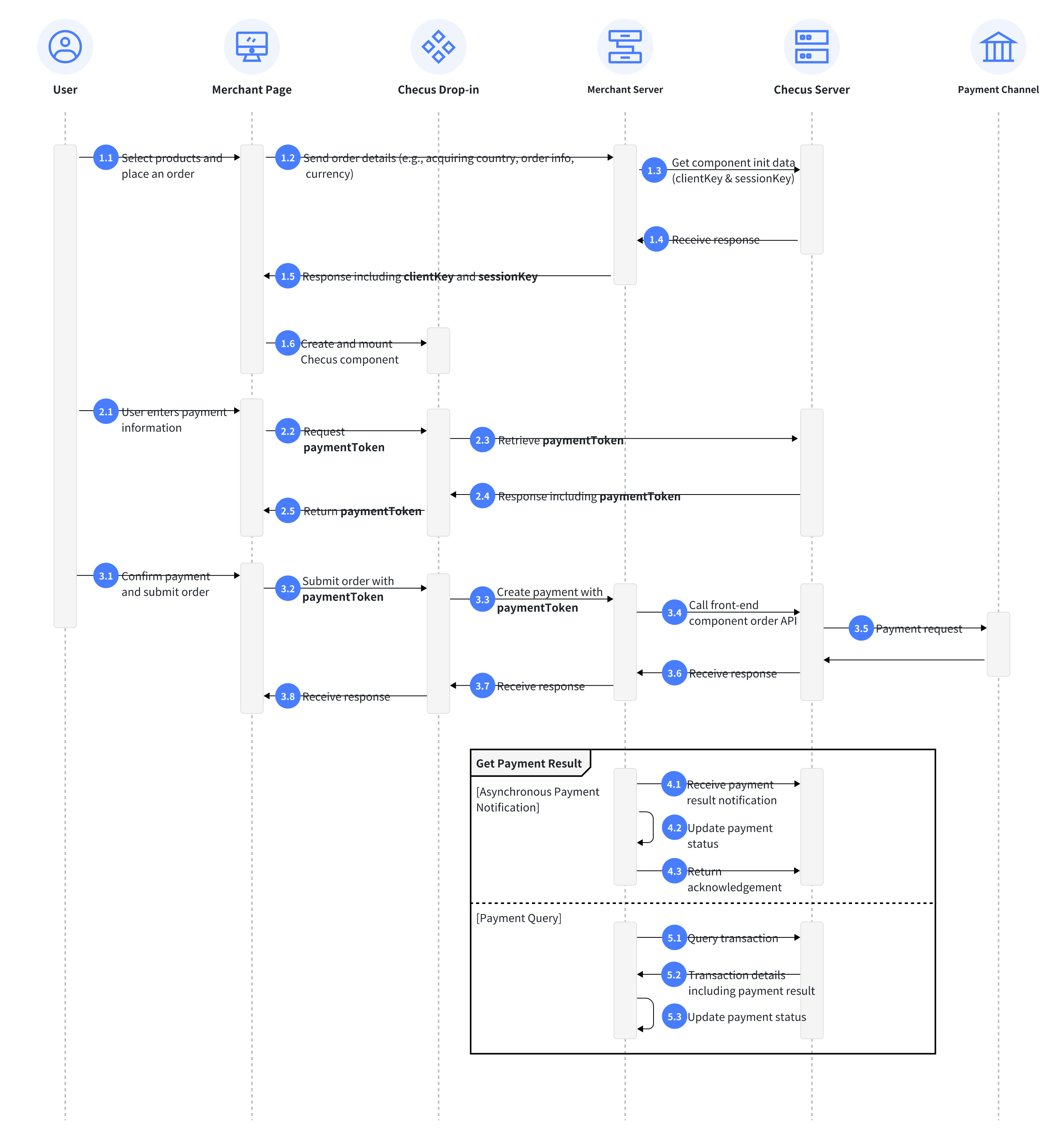
Key APIs
| Interaction | Direction | Interface Type | API / Method |
|---|---|---|---|
| 1.3 Get Drop-in Component Initialization Data | Merchant -> Checus | Backend API | /applyDropinSession |
| 1.6 Create and Mount Checus component | Merchant Client -> Checus Drop-in JS SDK | Frontend API | PMdropin.create |
| 1.6 Create and Mount Checus component | Merchant Client -> Checus Drop-in JS SDK | Frontend API | PMdropin.mount |
| 1.6 Create and Mount Checus component | Merchant Client -> Checus Drop-in JS SDK | Frontend API | PMdropin.on |
| 2.2 Get Payment Token | Merchant Client -> Checus Drop-in JS SDK | Frontend API | PMdropin.emit |
| 3.4 Create Payment via Drop-in Component | Merchant -> Checus | Backend API | /orderAndPay |
| 4.1 Payment Result Notification | Checus -> Merchant | Backend API | /collectResultNotifyUrl |
| 5.1 Query Payment Transaction | Merchant -> Checus | Backend API | /orderQuery |
Card Payment Integration Steps
1. Create Payment Session
Call the Drop-in Component Initialization to initiate a POST request to create payment.
Retrieve clientKey and sessionKey from the response. These are required to initialize the frontend component.
{
    'Content-Type': 'application/json;charset=utf-8',
    'Accept': 'application/json',
    'sign': <Refer to: https://products-docs.checus.com/en/doc-center/integration-guide>
};

request.body =
    {
        "version": "1.1",
        "keyVersion": "1",
        "requestTime": <Replace>,
        "merchantNo": <Replace>,
        "appId": <Replace>,
        "data": {
            "country": "MY",
            "currency": "MYR",
            "totalAmount":"50",
            "userId": "20220622_00086",
            "componentList":["APPLEPAY","CARD"]
        }
    }

response={
  "msg": "",
  "code": "APPLY_SUCCESS",
  "data": {
    "sessionKey": "bf2c47b085e24c299e45dd56fd751a70",
    "clientKey": "bbd8d2639a7c4dfd8df7d005294390df"
    }
}2. Render Component
Download the demo example, replace the
clientKeyandsessionKey, and open locally to see the result.
- Import JS componentjs
<script src="https://dropin.checus.com/dropin/js/pmdropin.min.js"></script> - Add mount container.js
<div class="frame-card"> <!-- form will be added here --> </div> - Initialize the componentjs
// Initialize card component const card = PMdropin.create('card', { clientKey: "Client public key", // Obtained from data.clientKey in Step 1 sessionKey: "Session token", // Obtained from data.sessionKey in Step 1 sandbox: false, // Default is false, i.e., production environment hideSaveCard: false, // Whether to hide save card option, default is false (shown) hideCardBrands: false, // Whether to hide card brand logos; in top left, default is false (shown) }); // Mount the instance card.mount('.frame-card'); // Mounts to the first matching DOM element // Component ready event card.on('ready', () => { // Remove custom loading indicator }) - (Optional) Listen for form status changes.
Real-time callbacks will be triggered when the status changes, which can be used to determine whether the payment button is enabled.
card.on('form-check', (res) => {
  // res.isFormValid indicates the form validation status: false/true
  // true: form validation passed, payment can be attempted
  // false: validation failed, payment button should remain disabled
  console.log('[dropin][form-check]:', res)
})- Retrieve the payment token and submit the payment.
Before calling the payment API, check if the payment is allowed. If allowed, use the obtained paymentToken to initiate the payment request.
card.emit('setDisabled', true) // Disable form after clicking Pay button to prevent duplicate submissions
card.emit('canMakePayment')
  .then(res => {
    if (res.code === 'APPLY_SUCCESS') {
      const paymentToken = res?.data?.paymentToken // Payment token to be used in the payment API
        // ❗️Call payment API
        // Merchant requests backend API to create order
        // Construct request parameters with paymentToken
        _postapi('orderAndPay',params).then(res =>{
          const code = (res || {}).code
          // Return payment result to frontend
          if (code == 'APPLY_SUCCESS') {
            //Payment successful, display result
          } else {
            //Payment failed, display result
          }
    }
      card.emit('setDisabled', false) // ❗️Re-enable form after payment API completes
    }
  })
  .catch(err => {
    card.emit('setDisabled', false) // Re-enable form on error
})3. Backend Order Creation
Trigger
After canMakePayment returns APPLY_SUCCESS, obtain the paymentToken and call the orderAndPay from the merchant backend to create the order.
Request Flow
The frontend sends
paymentTokento the merchant backend.The backend generates a unique
outTradeNoand submits a payment request to Checus.If the response contains
redirectUrlandstatus = PENDING, the frontend must redirect the user to this URL for authentication (e.g., 3DS).In other cases, return the payment result directly.
For detailed order fields, please refer to Drop-in Component Payment .
json{ 'Content-Type': 'application/json;charset=utf-8', 'Accept': 'application/json', 'sign': <XXX> }; { "appId": <Replace>, "version": "1.4", "merchantNo": <Replace>, "requestTime": "2024-06-05T10:46:01.694+08:00", "keyVersion": "1", "data": { "totalAmount": 77.44, "country": "HK", "expireTime": "7200", "paymentDetail": { "paymentToken": "332e4cc1af1740aeafe9e7df82aeb5a1", "buyerInfo": { "clientIp": "59.82.59.92", "userAgent": "Chrome" }, "sessionKey": "86409e2c04b44536a484caa5ce3ce0e9" }, "frontCallbackUrl": <Replace>, "subject": "GoGeal PTE. LTD.", "outTradeNo": <Merchant order number, must be unique>, "notifyUrl": <Replace>, "currency": "HKD", "userId": "3ff0495692d152be96d84dbc9352dc57", "integrate": "Direct_Payment", "terminalType": "WEB" } }
Card Frontend APIs
Usage Guide
The Drop-in Component provides standard API methods for frontend integration. Core methods are accessed via PMdropin.API.
| Method | Description | Reference |
|---|---|---|
create | Initialize component | See 1.1 |
mount | Mount component to page | See 1.2 |
on | Listen to component events | See 1.3 |
emit | Trigger component methods | See 1.4 |
1. create — Initialize Component
const card = PMdropin.create('card', options);ComponentName: Currently supports'card'(Card Payments)optionsparameter:
| Parameter | Type | Required | Default | Description |
|---|---|---|---|---|
| clientKey | string | ✅ | - | Client public key |
| sessionKey | string | ✅ | - | Session token |
| sandbox | boolean | ❌ | false | Enable sandbox mode |
| language | string | ❌ | 'en' | Display language |
| theme | string | ❌ | 'light' | Default theme |
| customLocalization | object | ❌ | - | Custom language pack |
| customTheme | object | ❌ | - | Custom styles |
| grayscale | string | ❌ | '0' | Page grayscale (0-1) |
| isRtl | boolean | ❌ | false | Right-to-left layout support |
| hideSaveCard | boolean | ❌ | false | Hide "Save Card" option |
| hideCardBrands | boolean | ❌ | false | Hide card brand logos |
| hideCardHolderName | boolean | ❌ | false | Hide cardholder name field |
| saveCardChecked | boolean | ❌ | true | Default "Save Card" checked state |
| ignoreUserCheckedCache | boolean | ❌ | false | Ignore cached user selection |
2. mount — Mount Component
card.mount('#card-frame'); // Mount to the specified DOM elementSupports both id and class selectors.
3. on — Listen to Component Events
card.on('ready', () => {
  // Component loading complete
});

card.on('form-check', (res) => {
  if (res.isFormValid) {
    // Form validation passed, can enable payment button
  }
});| Event Name | Description |
|---|---|
ready | Enable sandbox mode |
form-check | Returns real-time form validation status (res.isFormValid = true/false) |
4. emit — Call Component Methods
Common Methods
| Method | Parameter | Description |
|---|---|---|
canMakePayment | - | Validate form and get paymentToken |
setDisabled | boolean | Enable/disable form interaction |
switchLanguage | string | Switch language |
switchTheme | string | Switch theme |
addLocalization | object | Add custom language pack |
addTheme | object | Add custom theme |
setRtl | boolean | Enable RTL layout |
setGrayscale | string | Set page grayscale (0-1) |
4.1 canMakePayment — Validate Form and Get paymentToken
card.emit('canMakePayment')
  .then(res => {
    if (res.code === 'APPLY_SUCCESS') {
      const paymentToken = res.data.paymentToken;
      // Use token to initiate backend payment
    }
  })
  .catch(err => {
    console.error('Payment failed:', err);
});Response Structure
// Success
{
  code: 'APPLY_SUCCESS',
  data: {
    paymentToken: 'xxx'
  },
  msg: ''
}

// Failure
{
  code: 'FORM_INVALID',  // or UNKNOWN_ISSUE
  msg: 'Invalid params: cvv'
}Return Codes
| Code | Description |
|---|---|
APPLY_SUCCESS | Successfully obtained paymentToken |
FORM_INVALID | Form validation failed |
UNKNOWN_ISSUE | Other exception errors |
4.2 emit.switchLanguage
Refer to Customization
4.3 emit.switchTheme
Refer to Customization
4.4 emit.addLocalization
Refer to Customization
4.5 emit.addTheme
Refer to Customization
4.6 emit.setDisabled
- Set component availability status
- Type
Boolean - Default:
false
// Non-editable state
PMdropin.emit('setDisabled', true)

// Editable state
PMdropin.emit('setDisabled', false)4.7 emit.setRtl
- Set component right-to-left layout
- Type:
Boolean - Default:
false
// Right-to-left layout
PMdropin.emit('setRtl', true)

// Left-to-right layout
PMdropin.emit('setRtl', false)4.8 emit.setGrayscale
- Set component page grayscale
- Type:
String - Default:
0
// Set 0 - 1 grayscale value
PMdropin.emit('setGrayscale', '1')For more configuration, please refer to Card Customization
// Set form to non-editable state
card.emit('setDisabled', true);

// Switch language
card.emit('switchLanguage', 'zh-CN');

// Enable right-to-left layout
card.emit('setRtl', true);

// Set page grayscale to 100%
card.emit('setGrayscale', '1');Card Customization
Through customizing language and theme styles, you can better adapt to your website's UI and user experience.
1. Language Localization
1.1 Using Preset Languages
Support setting language parameter for quick language switching:
PMdropin.create('card', {
  clientKey: '',
  sessionKey: '',
  language: 'zh' // zh: Chinese, en: English (default)
});Can also dynamically switch through:
PMdropin.emit('switchLanguage', 'zh');1.2 Custom Language
If preset languages don't meet requirements, can add custom fields through customLocalization:
PMdropin.create('card', {
  clientKey: '',
  sessionKey: '',
  customLocalization: {
    // Add Chinese example
    'zh': {
      loading: 'Loading',
      loadingFailed: 'Loading failed',
      refresh: 'Refresh',
      confirm: 'Confirm',
      cancel: 'Cancel',
      removeCard: 'Remove Card',
      removeCardTip: 'Are you sure to remove the currently selected card?',
      addNewCard: 'Use New Card',
      useSavedCard: 'Use Saved Card',
      cardnum: 'Card Number',
      cardnumHint: 'XXXX XXXX XXXX XXXX',
      cardnumErrTip: 'Incorrect card number',
      cardbinErrTip: {
        // {cardOrg} variable field, no need to translate
        CARD_NOT_SUPPORT: '{cardOrg} not supported, please check card number or try another card',
        // {cardType} variable field, no need to translate
        CARD_INVALID: 'Card type {cardType} not supported',
        CARD_NO_INVALID: 'Please confirm if card number input is correct',
      },
      expdate: 'Expiry Date',
      expdateHint: 'MM/YY',
      expdateErrTip: 'Incorrect expiry date',
      cvv: 'CVV/CVC',
      cvvHint: '123',
      cvvErrTip: 'CVV/CVC format incorrect',
      name: 'Cardholder Name',
      nameHint: 'XX XX',
      nameErrTip: 'Name format incorrect',
      saveCardInfoTip: 'Save information for next payment',
      // Below are new multilingual fields
      // Local card additional collection elements
      buyerEmail: 'Email',
      buyerEmailHint: '',
      buyerEmailErrTip: 'Format error, please verify',
      buyerFullName: 'Full Name',
      buyerFullNameHint: '',
      buyerFullNameErrTip: 'Format error, please verify',
      buyerFirstName: 'First Name',
      buyerFirstNameHint: '',
      buyerFirstNameErrTip: 'Format error, please verify',
      buyerLastName: 'Last Name',
      buyerLastNameHint: '',
      buyerLastNameErrTip: 'Format error, please verify',
      // Peru Document(ID)
      dni: 'DNI',
      dniHint: '',
      dniErrTip: 'Format error, please verify',
      // Argentina Document(ID)
      dni_cuit: 'DNI/CUIT',
      dni_cuitHint: '',
      dni_cuitErrTip: 'Format error, please verify',
      // South Africa Document(ID)
      idCard: 'ID',
      idCardHint: '',
      idCardErrTip: 'Format error, please verify',
      // Colombia Document(ID)
      cc: 'CC',
      ccHint: '',
      ccErrTip: 'Format error, please verify',
      // Mexico Document(ID)
      curp: 'CURP',
      curpHint: '',
      curpErrTip: 'Format error, please verify',
      // Brazil Document(ID)
      cpf: 'CPF',
      cpfHint: '',
      cpfErrTip: 'Format error, please verify',
      // Chile/Paraguay/Uruguay Document(ID)
      ci: 'CI',
      ciHint: '',
      ciErrTip: 'Format error, please verify',
      buyerPhoneNo: 'Phone Number',
      buyerPhoneNoHint: '',
      buyerPhoneNoErrTip: 'Format error, please verify',
      buyerPhoneNoRegion: 'Phone Area Code',
      buyerPhoneNoRegionHint: '',
      buyerPhoneNoRegionErrTip: 'Format error, please verify',
    }
  },
  ...
});Dynamic addition method:
PMdropin.emit('addLocalization', {
  'zh': {
    // Parameters as shown above
  }
});2. Theme Styles
2.1 Using Preset Themes
Supports light (default) and dark themes:
PMdropin.create('card', {
  clientKey: '',
  sessionKey: '',
  theme: 'dark'
});Dynamic switching:
PMdropin.emit('switchTheme', 'dark');2.2 Custom Theme
Can customize CSS variables to override theme styles through customTheme:
PMdropin.create('card', {
  clientKey: '',
  sessionKey: '',
  customTheme: [
    {
      name: 'red',
      base: 'light',
      style: `:root {
        --color-primary: #e60000;
        --bg-primary: #fff;
        --border-radius-primary: 8px;
        // ... other styles
      }`
    }
  ]
});Can also add dynamically:
PMdropin.emit('addTheme', [{ name: 'red', base: 'light', style: '...' }]);